Web Development News


New Web Technologies in CSS that make Styling more Specific and Targeted and help Avoid Conflicts


Container Queries

When you think of creating a responsive website you likely think about using media queries and breakpoints for styling. While this works well, using this technology has its limitations. Media queries are only able to target elements based on viewport size, whether than be defined using pixels, ems, or rems. However, a new technology that addresses these limitations has recently been developed and has become stable across all modern web browsers. This technology is known as container queries. Using container queries, you can target the size and style of a parent to create responsive style changes in the corresponding child elements. This improves responsiveness by making styling more targeted and flexible. Unfortunately, style queries are not as well supported as container queries.

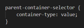
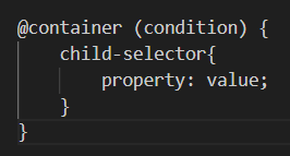
So, how do you use these technologies? Container queries must first be built by setting a container-type style on the parent. @container can then be used as well as breakpoints provided in parentheses that determine when the defined styles should be applied. Styling queries work alongside container queries. The effect of using style queries is further specification when applying styles to children of a parent container. When targeting the styles of the parent using style queries, the container, and the style property are used yet the container does not need to first be built. The format of a style query is as follows. @container is followed by style and a set of parentheses that identify styles coded into the HTML for the container, This is followed by brackets that contain optional selectors for further specificity and the styles to be applied.

As previously mentioned, in order to use a container query you need to first bult the container by assigning it a container type. Listed bellow are the most common value options for this property.

  • normal : the inital value
  • size : defines size based on inline a block elements
  • inline-size : defines size based on the online axis
Image of example code defining the container
Example syntax for defining a container
Image of container queries code example
Example syntax of a container query

:has() Selector

When styling your HTML, you likely use common selectors such as class, ID , and element. You may even use more complex pseudo-classes as selectors. A recent development in selector technology is the :has() pseudo-class. The :has() selector makes selection more specific by creating more requirements for styles to be applied. You can target elements that have certain children, elements, or styles applied to them. This essential means that you are able to target parents as well as children and sibling elements. Why is this so significant? Before now there has not been any way to target an element that is higher on the cascade from a lower element. For example, if you had a section tag that contained a paragraph tag and one that contained an anchor tag, you would easily be able to target only the anchor tag inside of the one container. However, you would not be able to target only the section that contains the paragraph tag without using an id or class assigned to this specific container. This new pseudo-class has the capability to be very useful in creating flexible styling and is supported across most modern browsers.

To use the has selector, you would identify the selector being targeted and like other pseudo-classes you would simply connect it that selector. You would then define what this selector must have in order to be styled. This would be contained inside of the parentheses following :has. Finally you would define your styles within a pair of brackets following the selectors.

Additional notes:

  • You are able to chain has selectors. This means that you can apply more than one has selector for a style declaration. To be applied, all conditions must be met.
  • You are able to list several conditions. Within the parentheses of the has selector, each separate condition is divided by a comma.
Image of example has selector code
Example syntax of the has selector

Scoped CSS

Scoped CSS is a new CSS technology with growing browser support that gives you the ability to further specify the requirements that an element needs to meet in order to have certain styles applied to it. Due to this function, it also aids in avoiding style conflicts. You may be asking how this is any different than using selectors or why it is even needed in the first place when selectors exist. This technology is different than previously existing css technolgy because it allows you to modify selector classes directly through styling rather than through a third party such as a javascript file.

Constructing a @scope rule is similar to using a basic selector in that it starts by using the @scope in a declaration. This would then be followed by what is called a scope start in parentheses as well as an optional scope end in parentheses. These would be connected by the word “to”. Then, within brackets, selectors and styles will be defined as usual.

You may be asking what the scope start and scope end elements of the declaration are. The scope start is the upper bound of the scope while the scope end is the lower bound. They define where the styles should start being applied and where they should end being applied. For example. You may have a styling rule where the scope start is defined as the class “open” and the scope end is defined as the class “closed”. In this case the scope start would first be considered, limiting styled elements to those assigned the “open” class. Then, the scope end would be considered to further limit the targeted elements. It would do so by defining where the styles would stop being applied, and in this case that would be when the “closed” class is reached.

Image of example scoped CSS code
Example syntax of using scoped CSS

Cascade Layers

A common issue with styling is the overlap of styles and conflicts between styles. This can cause certain elements to have unintended styles applied to them or for other elements to be missing intended styles. A new technology has been developed to eliminate this issue. This technology is known as cascade layers. Cascade layers allow you to set the priority levels of your styles in groups. Not only does this help avoid CSS conflicts, but it also allows you to create more specific and organized styles. This technology is supported across most modern browsers.

To use cascade layers, you would use the @layer followed by the name of the layer. You would then identify the specific selectors and styles that fall under this layer.

When using cascade layers, it is important to know how priority will be assigned and how this will affect the application of your styles. Layers are assigned levels of priority based on their location in a styles sheet. As with any other selectors of the same specificity, those defined further down in the style sheet have higher priority than those assigned earlier in the document. For example, say you have created three layers, on named top-layer, then next named middle-layer, and the final one named bottom-layer. In order for these layers to stack as intended, with top-layer on top and bottom-layer on the bottom, the bottom layer would first need to be defined followed by the middle and finally the top. Another priority consideration relates to the ability to create nested layers. This gives you the ability to group layers within a layer. The same rules of priority apply, with the nested layers defined last having higher priority that those listed earlier inside this specific layer. However, the priority would only apply for that specific layer and not layers defined outside of this group.

Image of example cascade layers code
Example syntax of using cascade layers